Data Stories Are Stories Before Anything Else
What you can and cannot say based on the data
The smallest unit of a story is the word, and therefore we should be careful with them.
We Tableau #datafam folk are data storytellers, we love our tools and pretty vizzes, the nifty tricks that go into making them. We love all that so much, that we spend an inordinate amount of time honing our skills, learning that one new trick, that new look, and of course the newest feature and how best to use it. I would argue that it’s worth spending just as much effort on our skill with words.
I will explain why I think that our language skills are so important, then share some examples of logic easily gone wrong, and close by listing tips and tools I use when I write tooltips and text.
Data analysts need to know how to write, not just code either
While most people know that data analysts know statistics and can write code, there is a part of our profession that gets a lot less attention: testing insights. When we train analysts, when we recruit analysts, we might want to stress more how important it is that logical reasoning is super important.
We rarely talk about this part of our job, we have a hard time teaching it, there are few books about this — I personally like Ben Jones’ take on this in his book Avoid Data Pitfalls— here is a webinar for a taste.
Arguably though, the diligence put into testing our logic, testing our assumptions is what makes our work valuable.
Questions to test:
- Do these insights make sense?
- Do the conclusions stand the test of logic?
Because many of you may be familiar with it, I chose a recent Makeover Monday as an example to demonstrate how to apply these questions — I’ll go through the data and point out some insights it does provide, and insights one might think are in there but aren’t.
Examples
These are from a dataset on girls and women at their arrival at two safe houses in Tanzania where they were protected from or protected after female genital mutilation (FGM) and other gender-based violence. Data covers just under two years and was provided by Hope for Girls & Women Tanzania, the organization running the houses and working to end FGM.
I didn’t want to make this post even longer than it already was, so please read about female genital mutilation (FGM) in Tanzania, and the great work Hope for Girls and Women does to end it, in this fantastic data story by Priya Padham. And consider donating directly to help with efforts on the ground.
Here is the top of the data table, so you get an idea of what is available.

In “Avoiding Data Pitfalls” terminology the below errors are all Epistemic Errors: we need to take a closer look at how we think about data.
a) Religion
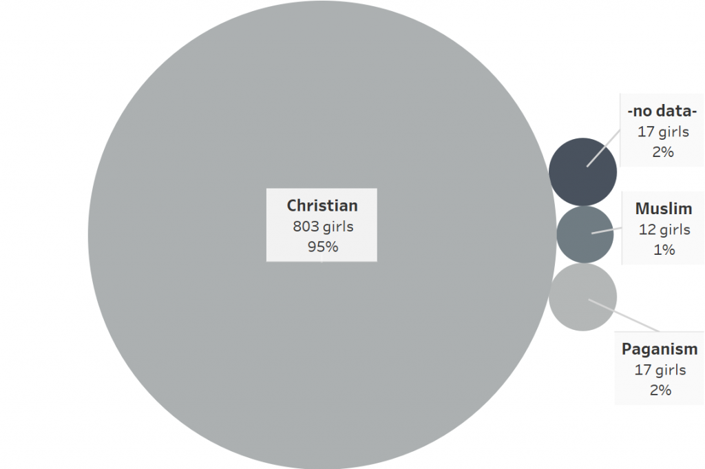
Looking at percentages of clients of different religions:

Based on this visualization, one could think:
Christians in Tanzania practice more FGM than followers of any other religion and come up with a statement like:
✘ 95% of FGM practitioners are Christian.
Is that true?
Well, is the data about who practices FGM?
From the data, we actually don’t know who practices FGM. We know, of the 851 girls and women who were taken in at the two safe houses operated by Hope for Girls and Women Tanzania, 95% identified as Christian at intake.
Therefore, a statement that we can confidently make is:
✔ 95% of girls and women protected in the safe houses were Christian.
Maybe more Christians are aware of the safe houses. Maybe the police are Christian and therefore more inclined to help Christian girls.
I don’t know what the true answer is here. The first statement might be true, but based on the data, we cannot make it, because we do not have enough information.
b) Age Distribution

Based on this chart, let’s consider the following statement:
✘ The youngest girl saved from FGM was one year old.
On closer examination, no, that’s not what the data says.
What the data does say is that the youngest person who arrived at the safe houses was 1 year old.
Her reason for admission was “violence”, which it turns out means that the girl has experienced violence and was admitted to the safe house for further protection.
A statement we can make based on our data is:
✔ The youngest girl admitted to the safe house for protection was only one year old.
c) Type of Case

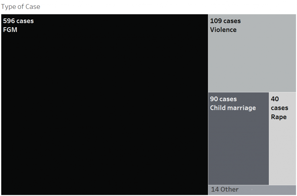
Based on this chart, is it fair to say that:
✘ 596 girls were rescued from FGM.
One would think so, right? The data is from the intake of the safe houses, and it shows the type of case for each admission.
The data dictionary reveals that, actually, an FGM case means the girl was either rescued and protected from FGM or had already undergone FGM and was admitted to the safe house to protect her from further harm.
What we can say, based on the data, is:
✔ 70% girls (596 girls and women) were admitted to the safe houses either to prevent FGM or to protect from further harm after undergoing FGM
My final dashboard
After going through the reasoning described above, here is my final dashboard:
Clicking on the image will get you to the interactive version on Tableau Public.
I ended up not including the facts about religion, as I found that statements that could be made from the data were not interesting enough to point to.
Tools I use
a) Data dictionary: If there is one, reading through it can help understand assumptions, considerations, scope, and methodologies used during data collection.
An interesting insight into the type of case from the data dictionary of the Tanzanian safe houses:

This part helped with the claim about the one-year-old above.
b) Time: I like to let my creation sit a day, then go through it and ask: is this statement supported by the data? Could the data support another, contrary, statement? Even if I don’t have a day it’s still helpful to physically step away from my computer, then come back and look with fresh eyes and brain.
c) Avoid Data Pitfalls checklist: Ben Jones, the author of Avoid Data Pitfalls, has published a free checklist on his website. It’s a good tool to go through the different pitfalls all along the process of collecting and interpreting data.
d) Feedback from others: consider asking other data professionals, subject matter experts, someone totally unfamiliar with the topic, the people who the data is about. And yes, my family and friends are used to being shown a viz and being asked their thoughts.
e) Words: Your editing tool of choice has spellcheck, but Tableau doesn’t. I like to export my Tableau viz to a pdf, and then use Ctrl+A to select and copy text. Grammarly.com serves as a spell check with additional grammar and style suggestions. Titlecase.com is great when I’m not sure about capitalizations.
Pro tip: remember the tooltip text.
Words are important
While the examples I showed might appear trivial, they point to pitfalls we face in personal projects just as much as in our day jobs.
Although the consequences of logical errors or unsupported claims may not have as much of an impact on the bottom line for our personal Makeover Monday projects as at work, they do have a financial impact and visibility far beyond our DataViz community. For example, Hope for Girls and Women received significant exposure on Twitter and Tableau Public during the week it was featured on Makeover Monday. This exposure could mean more donations so they can continue their work during the novel Coronavirus pandemic, when funding is even more difficult to come by.
Consider donating to the grassroots work by Hope for Girls & Women Tanzania‘s to end FGM.

