Small Multiples: Conquering my Fear of this Type of Viz
Storytelling with Data’s January challenge is working with small multiples. I have been seeing these types of visualizations by accomplished Tableau public authors — and have been very intimidated by them myself. So, in the spirit of learning, and going beyond my comfort zone, I have decided to make a visualization using small multiples.
But with what data?
While this would certainly be possible with Superstore, I would like to show something that actually interests me, and the fictitious ACME superstore data does not.
Enter #20for20Tableau, a selection of 20 datasets, curated by Sean Miller, and made available via a Tableau dashboard (what else). I had a quick look and decided I was going to try and build a visualization with small multiples showing the evolution of human height over the years. I am really trying to stay simple here, and not go into all sorts of fancy dashboard actions, filters and what not, I want to learn how to build a small multiples viz.
Selecting what to show
Now that I have a data set, I need to select what to show in small multiples.
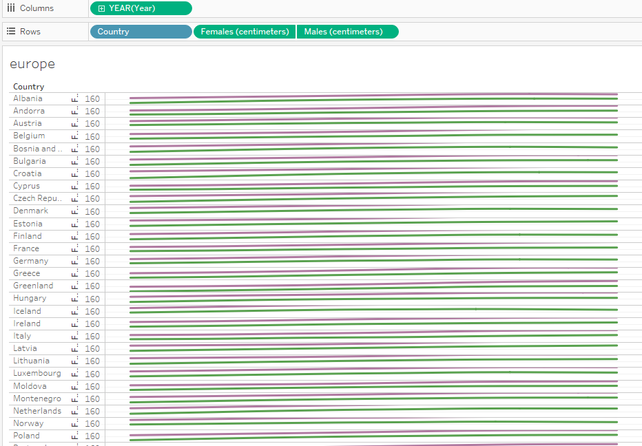
In the spirit of keeping it simple, I created a dual line chart with one line for females, and one line for males, showing all the years available, per country, and I selected countries in Europe, giving me 39 rows.
Looking quite illegible, as can be expected, here:
Now comes the calculations for the grid, and while there are many tutorials out there, the one that resonated with me was Chris Love’s post from 2014.
This is where I am at now:
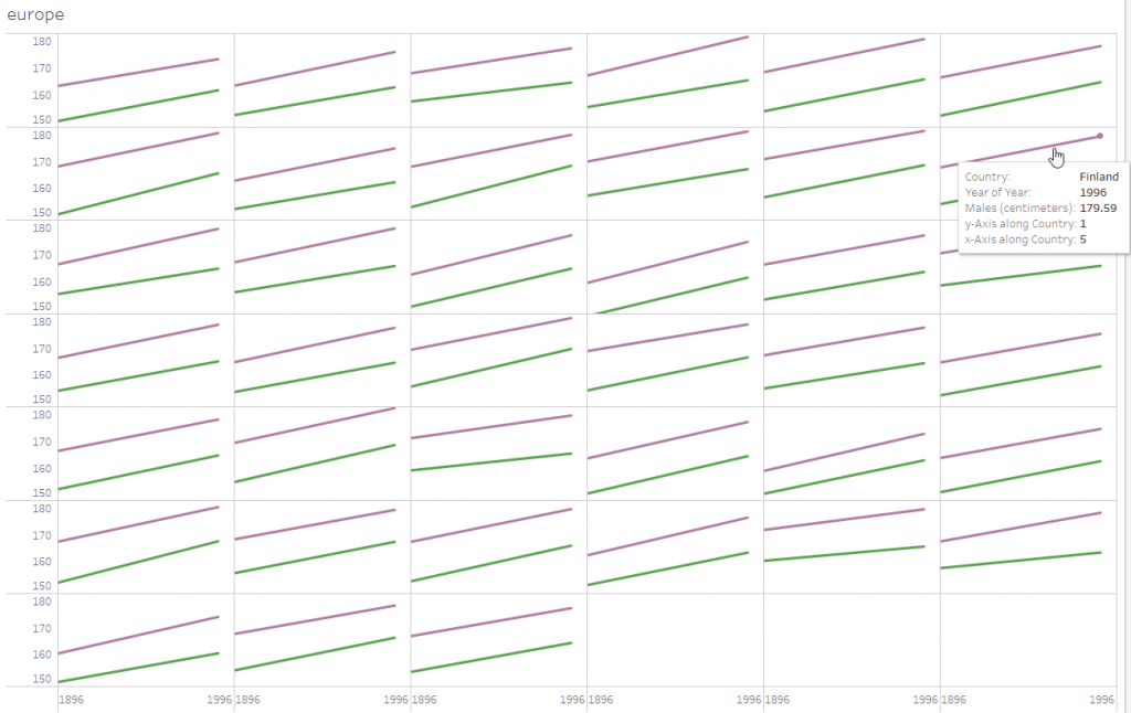
And, still in the interest of keeping it simple, I am only going to format a bit and then calling it done.
I have already removed the headers and the gridlines. Now to add country labels in each cell. And while I started out with timelines, I decided to convert these to simple slopecharts, again, in the interest of simplicity.
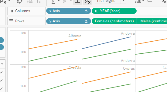
I am still a bit unsatisfied with the look of this: the data is all there, and the user can hover and see detail. I would like for the user to be able to select:
HIghlight the country with shortest/tallest women/men in 1896/1996.
Therefore, I will need: three toggle switches. And then, based on these, I need to be able to highlight the country that fulfills these search parameters.
While I already know how to create parameters for the three toggles, I do not know how to highlight a country.
I thought that this post about Colour, Highlight and Set Action would point me in the right direction — but I found myself with only the males’ height line highlighted/changed colour, not sure why.
This is where I am stuck. I am going to ask for help – I just can’t find the relevant information by myself. And I know this is something that is possible.
And this is what my visualization looks like right now, on Tableau Public.