MakeoverMonday Week 1, 2020: It’s a whole new ballgame in the States!
What I wanted to focus on this week, mostly because of what I thought could have been greatly improved from my work last week, is getting clearer on my story first, and then build the viz from there.
The original Viz

What works well
- The timeline on the x-Axis: it’s what we are used to
- Using a line chart
- A clear title and subtitle
What could potentially be better
- Looking at it, I am not entirely sure what the % numbers are
- The vertical grid seems irregular (this could be an optical illusion though)
- It is unclear which line is baseball and which is basketball
- There is no “so what” in the title: why should we care? — it became really clear when I read the article, which gives ample “so what”, but the chart by itself does not
- The three colours do not add meaning
- The grid lines are not necessary
- The lines are very smooth up to 1990, then wiggly: looks lie more data became available
My Plan
At this point, I can go any of three ways:
- Find correlations or rather co-timely occurrence with economy, wars, societal events, but this would necessitate more research, not what I want to focus on at this point in my learning
- Just leave the graph as is, but better – decide to go with this, because it fits best with my learning goals
- Come up with an entirely original idea
I am checking the time, of my original 1 hour to do this #MakeoverMonday exercise, 45 minutes are left.
Interruption to my process
I just downloaded the data from data.world, and see it does not seem to correspond to the original graph.
So now, I am checking the data. Reading the article that the original chart was part of. So interesting! Getting very much lost in trivia (who knows, might come in handy as lunch time conversation at some point).
Here are the notes I took from the article, that I would like to incorporate in my story:
- US used to be a baseball country, now a football country
- starting in the 90s, baseball is tied with basketball as a preferred spectator sport
- American exceptionalism: most everyone in the world loves soccer, but America — this is not true, there are other “exceptional” countries, what with cricket in India and Australia, table tennis in China, skiing in Austria –> will not include this comment in my story
- in the late 60s, baseball and football switched their places, baseball becoming #2 and football now #1
- this coincides with 1966 formation of modern NFL from the merger of AFL and NFL, and creation of Super Bowl
- there is a story about head trauma in football, and while interesting and concerning, and maybe worthy of a PSA, I later decide to leave this out of my viz in the interest of focus
- only about 8% of the time of a football game (only one example the author timed) is actual play time, the rests are breaks and commercials –> doesn’t fit in with my story, will leave out
time check: 30 minutes left
Making a plan for my viz
Following the steps that Chantilly outlined in her blog post describing her process for her union membership viz. Listing the big messages here:
- Americans’ preference has shifted from baseball to football over the last century
- This shift coincides with the creation of the Super Bowl and the merging of NFL and AFL
Views needed for these two
- Line chart with baseball and football only, 1940-2010
- One annotation with 1966: merge of NFL+AFL and creation of Super Bowl
Creating a template
- deciding on laptop size (just because I am working on a laptop screen)
- put my usual data source, source viz, design by footer
- put title and subtitle at top
- and now that I have a “normal proportions” line graph to the right of the middle space, I have a ton of space on the left for some sort of imagery
- am wondering if I could visualize the shift of preference by colouring one half of the page one and the other another, but decide to stick with the line graph, as there is no real iconic colour for baseball nor for football (except the brown of the pig skin, and the white with red stitching of a baseball, but I don’t like brown…)
time check: 23 minutes left, trying to hurry up now. Note that I am still almost only working on paper at this point, nothing in Tableau yet
Thinking about a colour scheme
I am doing google image searches for NFL, MLB, baseball, football and looking at the mosaic of mostly photos to see what stands out: I find that white, blue and red seem to be present a lot. And I decide to go with that. These colours also have the advantage of being the colours of the US.
Should I do:
- red on white? no, that’s boring
- blue on white? even more boring, cause it’s the default colour of Tableau
- white on red? too jarring
- white on blue: yes, going for that
Playing around with words for the title/big message
- watching the ball game
- take me out to the ball game (google this quickly, find it’s the baseball anthem, so maybe not such a great title, as it refers to one of the two only, and also, hardly understandable to the international audience)
- it’s a whole different ball game — I like this one.
Imagery
I decide to keep it simple, and go to Noun Project for simple baseball and football icons of the balls. (end up downloading each icon twice, because first I download them in black, then I decide I want to use red as the emphasis colour of my story, the colour for football, so download the football in red, the baseball in white)
Building things in Tableau
Because the data on data.world is not sufficient to reproduce the original graph, I go to the source, and copy Gallup’s data into an Excel file. Data extract into Tableau, and pivot the data, so I have one line for each set of (year-sport-preference). Start to make the line chart, with the colours I decided on, deleting grid lines and a whole bunch of other things that Tableau puts in there by default. At some point, I am wondering about a peak of the data, that I don’t remember seeing in the original and I realize I had use an aggregation by SUM, and had several data points in one year. Decide to go with no aggregation first, find the jump weird, decide to use MIN() instead and choose to not mention the omission of one data point in the visualization as I think it is immaterial to the message here.
Accessibility
I am checking for accessibility for colour vision impaired people, and I think things are alright.

This is what my Tableau dashboard looks like at this point:
Next, I homogenize my font choices and font size choices. While I already had only used Tableau fonts, my font sizes were a bit all over the place. Chantilly’s recommendation is to limit yourself to 4 sizes, I decide to try things with three sizes, as my viz is rather small (laptop screen size): 30 points, 12 points, 8 points
I’m starting to like the look of things.
And, last: contrast accessibility check. The red writing on my blue background are not providing enough contrast. I am taking the recommendation of the site, and change the background to a much darker blue.
Going through my own checklist
- look at article and viz
- jot down first ideas
- what works
- what doesn’t work
- what could be changed
- make first spreadsheet viz to see if data shows what I think it does
- Find a focus for your viz — the so what of the viz
- set dashboard size to fixed
- plan the layout for the dashboard
- Does the colour add meaning? If it does, can I use it in the text elements as well? (title, tooltips)
- Is the icon/image necessary?
- Simplicity/clean — in my Fast Food viz, this was an issue
- make pretty tooltips
- spellcheck
- publish to tableau public
- check formatting on tableau public online
- tweet @CharlieHTableau @TriMyData #MakeoverMonday. Any suggestions welcome! #mmvizreview include a link to tableau public, not to my blog
- register for the webinar
- submit on the MakeoverMonday blog
At this point, I notice that this checklist needs updating. I hope in a few weeks, months? I won’t need the checklist any more as a step-by-step map, but rather just as a last quality control check before publishing.

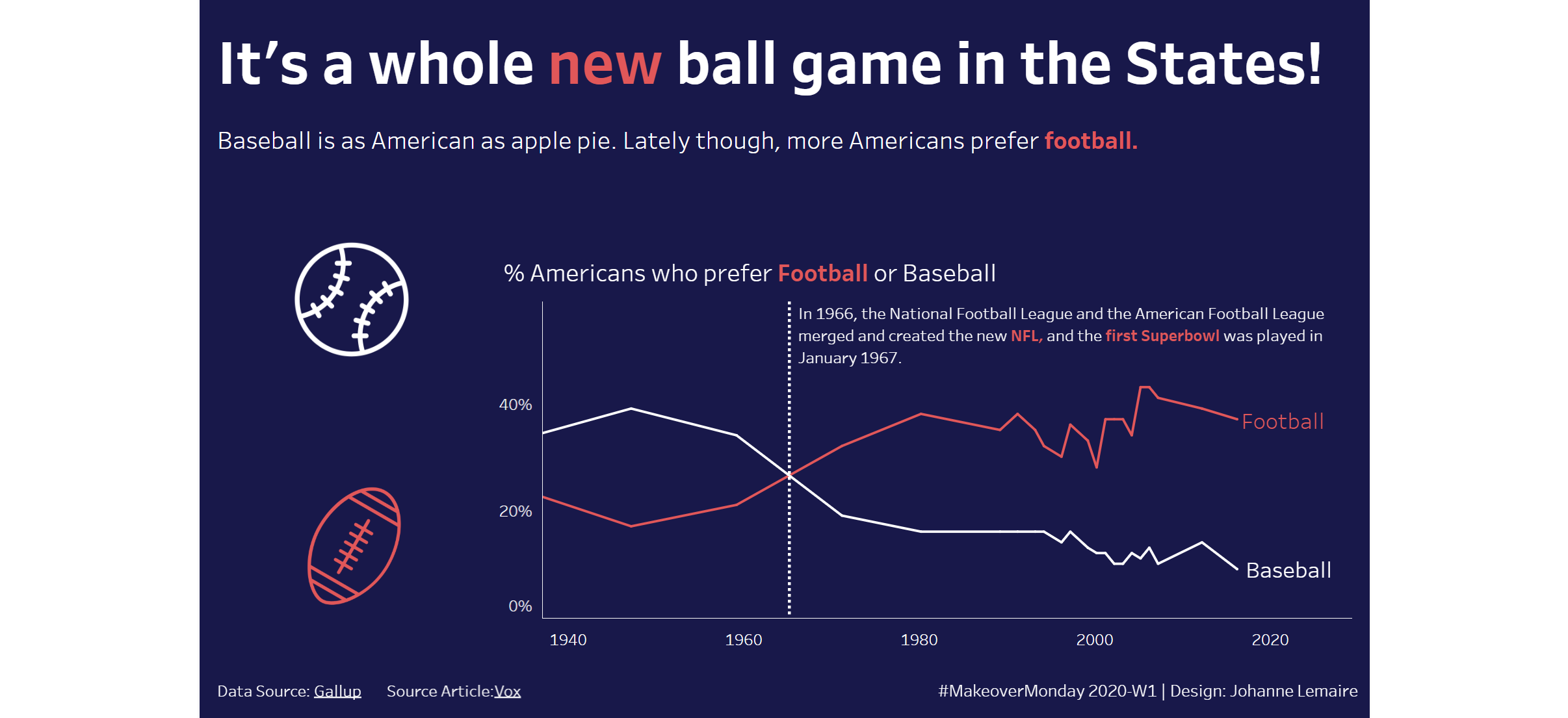
Here is the final product: (and link to tableau public)