MakeoverMonday 2020/W17: Road Fuel Prices
Continuing on my theme using the steps of critiquing and iterating on an existing chart from Scott Berinato’s book:
The original chart:
from here: https://www.racfoundation.org/data/uk-pump-prices-over-time
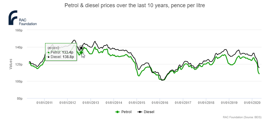
1. What I see first
- green and black, very close together (is there some significance to petrol being green?), why are we even looking at both?
- ups and downs, no explanations, rather jittery curve
- dates are unnecessarily long,
- tooltip duplicates the axis
- source is not given
- unnecessary axis label for y-axis
2. First idea that comes to my mind
Overall, the chart is good.
My first idea is to take away unnecessary items:
- the grid lines
- the y-axis label
- the full date on x-axis
- choose either petrol or diesel (probably petrol)
- take away colour
And my second idea is to add context for the up and down, but that would require further data, and is my usual time sucker rabbit hole, so I am abandoning that right away.
3. Likes, dislikes and wish-I-saw
| Like | Dislike | Wish I saw |
| line chart | two types of fuel | call-out of political or economical events |
| black on white | full date on x-axis | geographic region in the title |
| vertical y-axis label | ||
| grid lines |
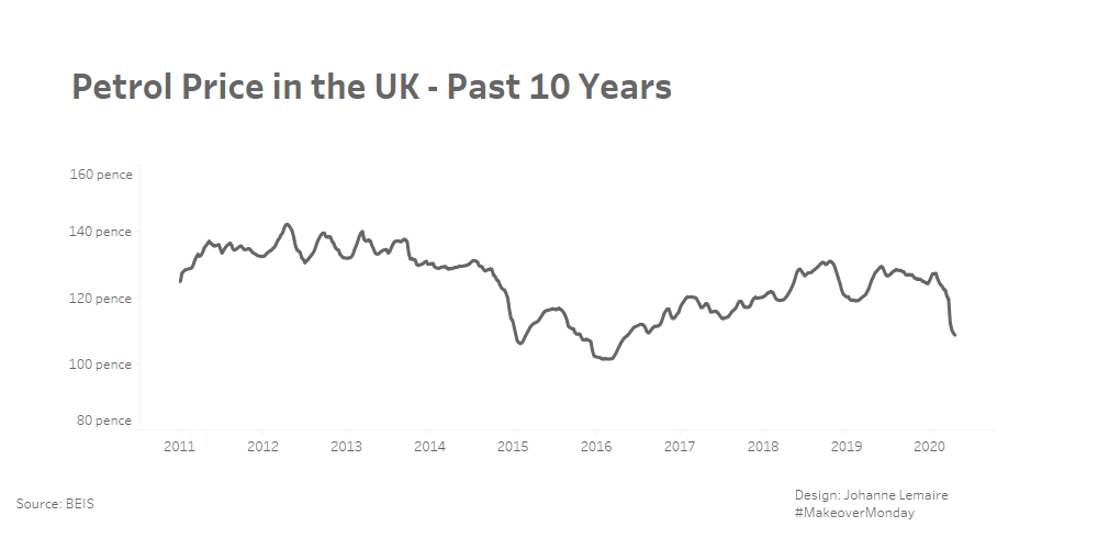
4. Three things I want to change
- remove clutter: grid lines, y-axis label, full date on x axis, only show one type of fuel, no colour
- include UK (or whatever the region actually is, and average) to the title
- include source of data
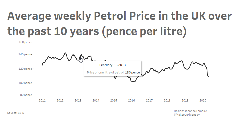
5. Prototype (1st iteration in Tableau)
Critique:
- title seems too large compared to the rest
- colour of line should be same grey as title
- and I am confused by the labelling of the data as USD, while it is identical to the source, I wonder whether someone took the wrong data file to create the source visualization — turns out it is not US Dollar, but rather an abbreviation of unleaded petrol…, so currency is fine
My final iteration