Iteration after Viz Critique
In business life, learning from feedback is what we do. Every day. And when you build tools for others, that involves a process where you ask lots of questions before you start, while you do, and after you do. And then you iterate. Personally, I believe that this is one of the most important skills to hone to improve your work: getting this cycle right, including not thinking that you are done when you are done.

I am soo thankful for the MakeoverMonday community and to the two hosts for the weekly feedback they give: I learn every single time, not only from feedback for my own builds, but also from every single build someone else shows.
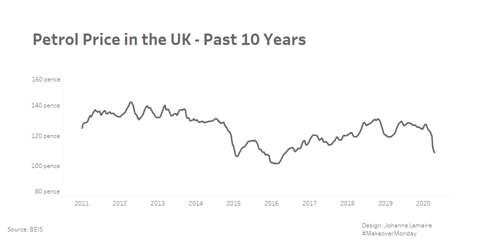
Charlie and Eva’s feedback to me personally was:
- maybe the minimalism has gone too far
- maybe the format is too wide
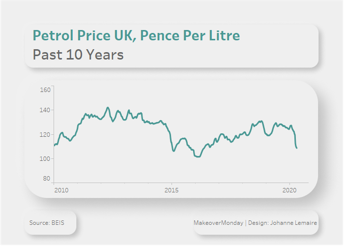
- it would be good to have the units in the title
A friend also suggested these:
- it might be good to have tick marks
And I watched the Lovelytics webinar with Chantilly Jaggernauth today, so I thought:
- might be a good opportunity to try figma and the neumorphism look (even though that is against my original goal of total minimalism)
- a bit of colour makes life more beautiful
This is what I came up with:
