Mortgage Offers Comparison Tool – Or the Story of How User Stories Change
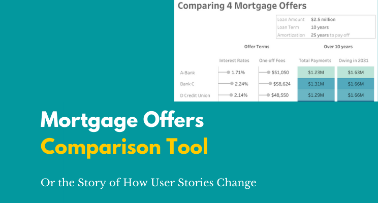
Sometimes, rarely, real life and vizzing meet and I get to use data visualization outside work. The scenario: We have to refinance our $2.5 million mortgage for our co-operative’s 32-unit building. We have four offers, and want to choose the best option. Dataviz to the rescue!!! – At least, that’s what I thought. What came […]