An Exercise in Decluttering
I am so happy to have found this field of data visualization and to be able to progress and learn in this space. So, of course, I had to go and buy books, right?
Just to recap, so far, in my learning journey to data visualization and data analytics, this is what I have been doing since the last four weeks, when I took the plunge and decided to commit to working hard to get better:
- taking a 5 class specialization in Data Visualization with Tableau through Coursera with UC Davis
- participating to MakeoverMonday by submitting to weekly challenges, taking feedback on and iterating my designs, and also playing around with old data sets
- chatting with the online community on Twitter (#MakeoverMonday, #datafam, #momswhoviz)
- reading books
- participating to the Storytelling with Data Community online
So tonight I thought I’d do a “simple” exercise. At the same time, I feel that almost nothing I do in dataviz at this point is truly simple or routine yet.
This is an exercise from Storytelling with Data – Let’s practice by Cole Nussbaumer Knaflic.
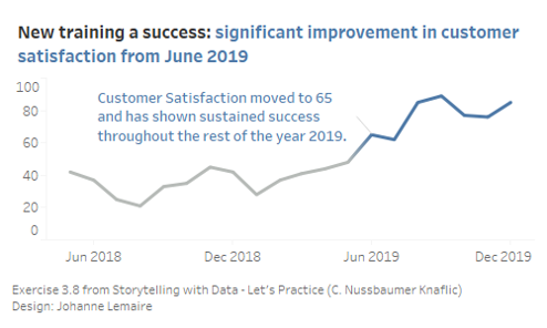
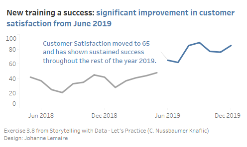
It’s about decluttering a given chart. For those who have the book: Exercise 3.8, page 141
What I want to change, Step 1, removing things:
- remove the digit after period on the y axis
- change from bar chart to line chart
- label the data points only at the start and end, or maybe only after it’s higher than 60 (post June 2019)
- change labels on x axis, so that it’s only May 2018 – Jan 2019 – December
- emphasize the rise beyond 60 starting in June 2019
What I want to change, Step 2, adding things:
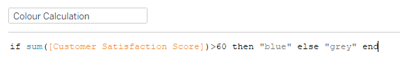
- colour only when higher than 60 (group in Tableau?)
- Change the title to a message title, something like: Starting in June 2019, Our Customers are Happier!
- Maybe put a vertical or horizontal reference line at that point — have to see how things look
Now to download the data and plug it into Tableau.
This is what happened, when I used a Set to put in two colours:
Surprise: the line got interrupted.
This is not what I wanted, as it looked as if I was displaying two different data series.
So, I tried to see what would happen if I’d use a simple calculated parameter and drag that on colour. It worked! (and it produced a colour gradient, that I don’t seem to be able to get rid of, and find rather cool).