Mortgage Offers Comparison Tool – Or the Story of How User Stories Change
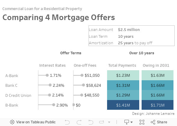
Sometimes, rarely, real life and vizzing meet and I get to use data visualization outside work. The scenario: We have to refinance our $2.5 million mortgage for our co-operative’s 32-unit building. We have four offers, and want to choose the best option.
Dataviz to the rescue!!! – At least, that’s what I thought. What came about was a lesson in humility and how user stories change, and how to apply minimum viable product. I guess we all stumble and take detours before we get to the polished thing we publish to Tableau Public.
Creating the data table
I chose to make a spreadsheet in Google based on the four slightly confusing text-based documents provided by the lenders.
I found an existing mortgage calculator template in google sheets, adapted it for our truncated loan where the amortization of the loan is 25 years, whereas our loan term is only 10 years. I had five tables in my spreadsheet: one for the terms of all four loans, and one each for the amortization table for each loan.
Creating a viz to compare
I stubmled across Adam Crahen’s fantastic Mortgage Calculator on Tableau Public, so I had something great to live up to, and I was struck by the idea of creating a mortgage comparison tool that could be useful to others. I really should write more about how genius that mobile mortgage calculator really is, and he wrote it in 2016 folks, but just go read his blog post to find out.
I quickly learned that this whole endeavour is going to take much longer than I thought.
Alright, so let’s see where I’m at:
- Google spreadsheet with the information of the four mortgages I want to compare.
- a highly ambitious user story
- As a person who wants to compare up to four different mortgage offers, I want to input the loan term, amortization term, interest rates, non-refundable fees of the different offers into the online tool, so that I see a chart comparing the different offers.
- a meeting in two days where I want to present a visual comparison of the four offers.
and my birthday tomorrow, that I want to spend with family and not (entirely) in front of the screen.
Reality Check
My user story is too ambitious for my time frame, and it goes beyond what I need for Monday. New user story:
- As a finance committee member, I want to show a visual comparison of the four mortgage offers, so that the differences become clearer than by looking at a crosstab.
That means that I do not need an interactive tool – taking away most of the coding effort.
One Day later, it’s my birthday
And I still don’t have even an MVP of a dashboard. I’ll spare you all the back and forth. Suffice it to say that I went through difficult-to-use data structures before coming back to #tidydata by unioning my four amortization tables in Tableau. My user story is still the same, however, I had two or three dead end tries at implementation, before landing on a very simple dashboard that is designed to be viewed on mobile.