MakeoverMonday 2020/W16 Food and Greenhouse Gas
After a bit of a hiatus during which I concentrated on learning Python and the basics of data visualization in Python, I am back to MakeoverMonday — and maybe, just maybe, I’ll be able to catch up?
I just finished reading *Good Charts* by **Scott Berinato**, and want to use the process of critiquing and improving a chart the author describes, so that’s what I am following here below.
By the way, if you haven’t read the book, it’s definitely a worthwhile addition to your dataviz library — I love the contrasting of sketched prototypes with really well-tuned and thought out final versions matched with explanations of why those final versions work.
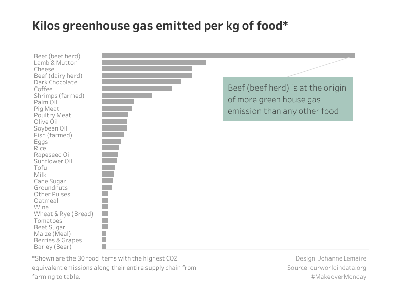
The original chart

And on to the critique, following Scott Berinato’s method
1. Noting what I see first
- loads of colours, not necesserily pretty or harmonious
- weird and busy icons that don’t seem to add anything beyond the headers
- lots of text in different sizes
- green and brown seem to dominate –> land use change and farm
2. The first idea that comes to mind
- My first idea is that I don’t see a clear message: while I saw that green and brown dominate, and that the first bar is the longest, it’s not immediately clear from only looking at the chart without the context of the article, what that means.
- There are two messages here: the category of ghg emissions across supply chain with their relative importance (1), and the amount of ghg emissions per food item (2) –> might be better to restrict the chart to only one idea/message
- the unit ghg emissision on kgCO2 equivalent per kg product is totally meaningless to me — any comparison to something real and relevant is missing
- I find it super interesting that the land use change ghg emissions are negative, and seem to “compensate” or rather equal the farming ghg emissions
- for me the surprising takeaways here are: (1) nuts and land use change, (2) transport, processing, packaging, retail are all relatively irrelevant compared to farming and land use change
- the not-so-surprising, well-known take-away is that a vegan diet is much better for the planet — but again, the values are not linked to any diet, but rather kg of food product, not relevant to life
- Question: can I link the surprising, new-to-me as well as less-talked-about insights (1) and (2) to individuals’ diets?, maybe compare a vegan diet to a “classic” Western dairy, meat and potatoes diet?
3. Notes on likes, dislikes and wish-I-saw
| Like | Dislike | Wish I saw |
| green and brown colours relate to land use and farming | too much text | one clear message or conclusion |
| flow-chart of the supply chain | unnecessarily complex icons | a simple, harmonious colour scheme |
| that nuts (and olive oil) have negative (I mean good) ghg emissions equivalent values for land use | 2 messages, neither of which is clearly called out | a comparison to something relatable (daily, yearly diet/use of family/person) |
| bar chart: easy to take in, especially how much worse beef is than everything else |
4. Three things I want to change and why
Right, while I would love to see so much more, especially the more relatable quantity of someone’s actual food consumption, I suspect it might be hard to find that data, and, maybe more importantly: that’s not really in the spirit of MakeoverMonday. This is hard for me – it feels much more natural to go and search for the data that I would _like_ to see here.
- I want to concentrate on a clear message, call it out in the header, and show only relevant data in the chart: eat more plants — this makes it more impactful
- I want to use grey/white with one accent colour (probably green) — makes it prettier, calmer
- can I use small multiples instead of the bar charts? two groups: plants/meat+dairy+eggs
5. Sketch of prototype
I tried out small multiples, and couldn’t get it to work, so I went with a bar chart combined with a heat map, in order to show both messages:
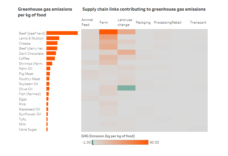
And then I came to my senses, didn’t I want to avoid putting two messages on there?
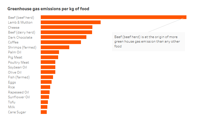
And instead of putting the whole in a big dashboard-like design, I will keep things simple, and only include my name, the source and the #MakeoverMonday hashtag, remove the orange colour which does not have any meaning any more in this simplified version, and coming out with a really simple clean looking chart: