Makeover Monday: 2020 week 5, Brexit Bond
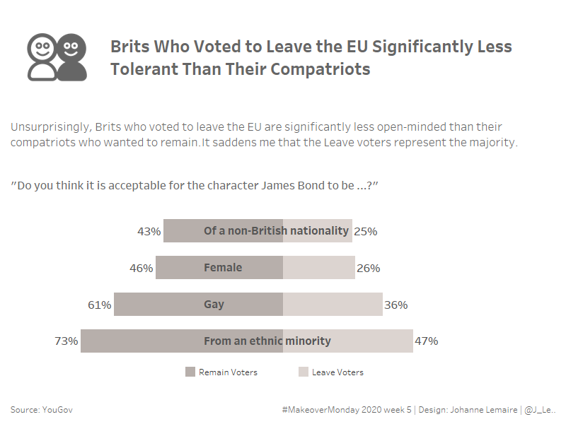
This week’s MakeoverMonday chart is this one:
Source: YouGov
Just a quick note: I tried to do everything in 30 minutes, but ended up spending a bit over 60 minutes on it. I knew what I wanted to build and had started building it within the first half hour, but then ended up having to look up how to make diverging bar charts (brilliant tutorial by Andy Kriebel, here).
The following are my notes from working on my viz.
What works in the original chart:
- has a clear title
- has a clear legend
- overall it’s a clean look
What doesn’t work (for me) in the original chart:
- there is no clear significance to this chart, why should I care (I like calling this the so-what of the chart)
- the contrast of the label on the grey part is a bit low
- while legible, this representation does not speak to me on a visceral, emotional level
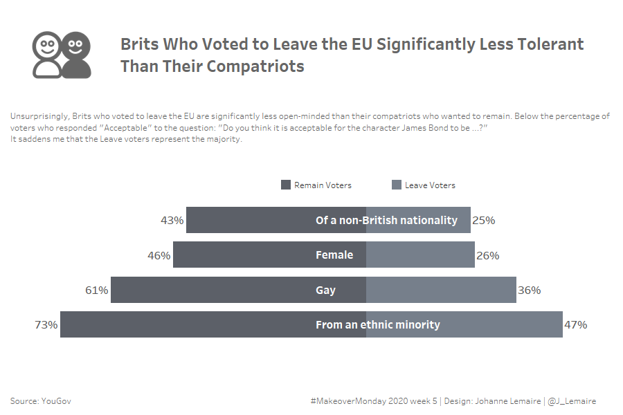
What do I want to do differently:
- My first reaction to Charlie’s decision to focus the chart on Brexit voters was a strong dislike. I don’t like having someone else pick a subset of available data for me, it goes against all my analyst’s instincts. Within MakeoverMonday however, this selection and focus ended up being a really good thing, as even with that narrow(er) focus, people still chose so many different ways to represent the data.
- I want to use an icon or an image or even several to up the emotional connection and impact of the viz
- for the same purpose, I will use stronger language for the title
- I decide to go with left/right diverging bars, because I think they are more easily perceived than those stacked bars
This is what I came up with:
This week I managed to be totally confused about the timing of the review webinar and therefore watched the recording.
During the webinar, I took notes, and decided on changes I wanted to make to my viz:
- I wanted to center the Zero line (by fixing the axes)
- I wanted to left-align the category names
- And I was wondering about the three different greys I used: I found that the whole thing lacked visual appeal
- I tried circles, but came back to the bars
Here is the iteration (clicking on the image will get you to Tableau Public).
Any and all feedback welcome!