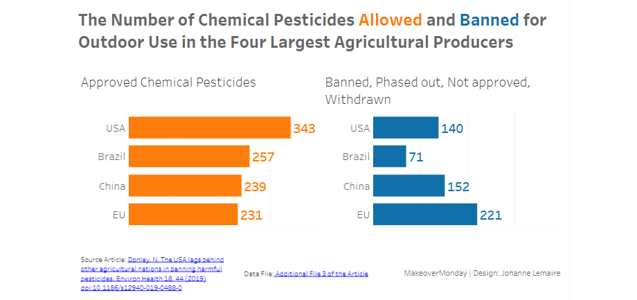
MakeoverMonday 2020-W2: Pesticides
The team at MakeoverMonday gives us the above to make over. And I look into the three questions recommended for analysis/makeover:
What works?
Good colour contrast and legible
What does not work so well?
- weird colour effect on the bars
- vertical orientation of the y-axis label
- “BRA” and “CHN” are not super readily recognizable as countries
- comparing three countries and one multi-national body
- not showing a bar for the US
- no source given, no year
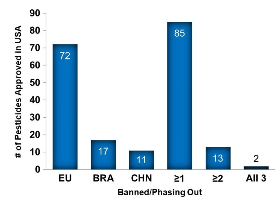
- not sure what >=1 etc means
My next step: looking at the data table.
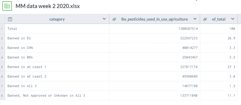
Now I am even more confused, as that data does not seem to have much to do with the visualization.
Reading the source article
You know how when you learn about data visualization and you are being told: don’t make a spelling mistake, you are going to discredit yourself and the entire viz? That’s similar to how my confidence in the article/author fell when I read the abstract that kept referring to the EU as one of the four nations, together with the US, China and Brazil that were being considered and compared.
Now I realize that this is not a political, geographical or financial publication, but I would think even ag scientists would know that the EU is not a nation? Well, that was harsh, however, that’s what I thought when I read the abstract.
Together with my confusion about the graph not matching the data (the second week in a row) as provided by MakeoverMonday organizers, and I have a hard time concentrating on creating a visualization.
So, as per my analyst and researcher background, I went to one of the original sources cited in the article, the FAO (excellent open data, by the way, here). The data there, I compared weight of pesticides used in the US in 2016, does not coincide with the data shown in the table above (which I think might come from the Environmental Protection Agency, a US institution, not sure, as no source is given, and as my patience for research ran out.)
What to do?
My main learning goal right now is to get better and faster at Tableau, not to critique research method, find and define the uncertainties in data.
I will make over the original chart (and not use the data of the table).
Here it is, clicking on the picture gets you to Tableau Public.